During the summer of 2020, I interned with the nonprofit Bridges for Enterprise (BfE). BfE is primarily run by business students and alumni from Cambridge, New York, and Singapore, who volunteer to give free consulting to social entrepreneurs in developing countries through its flagship incubation program. I was tasked with rebranding the organization and building a brand new website to give them a more professional look. Along the way, I worked with BfE leadership, who specialize mostly in business and tech, in order to fulfill their needs for the website.
RESEARCH
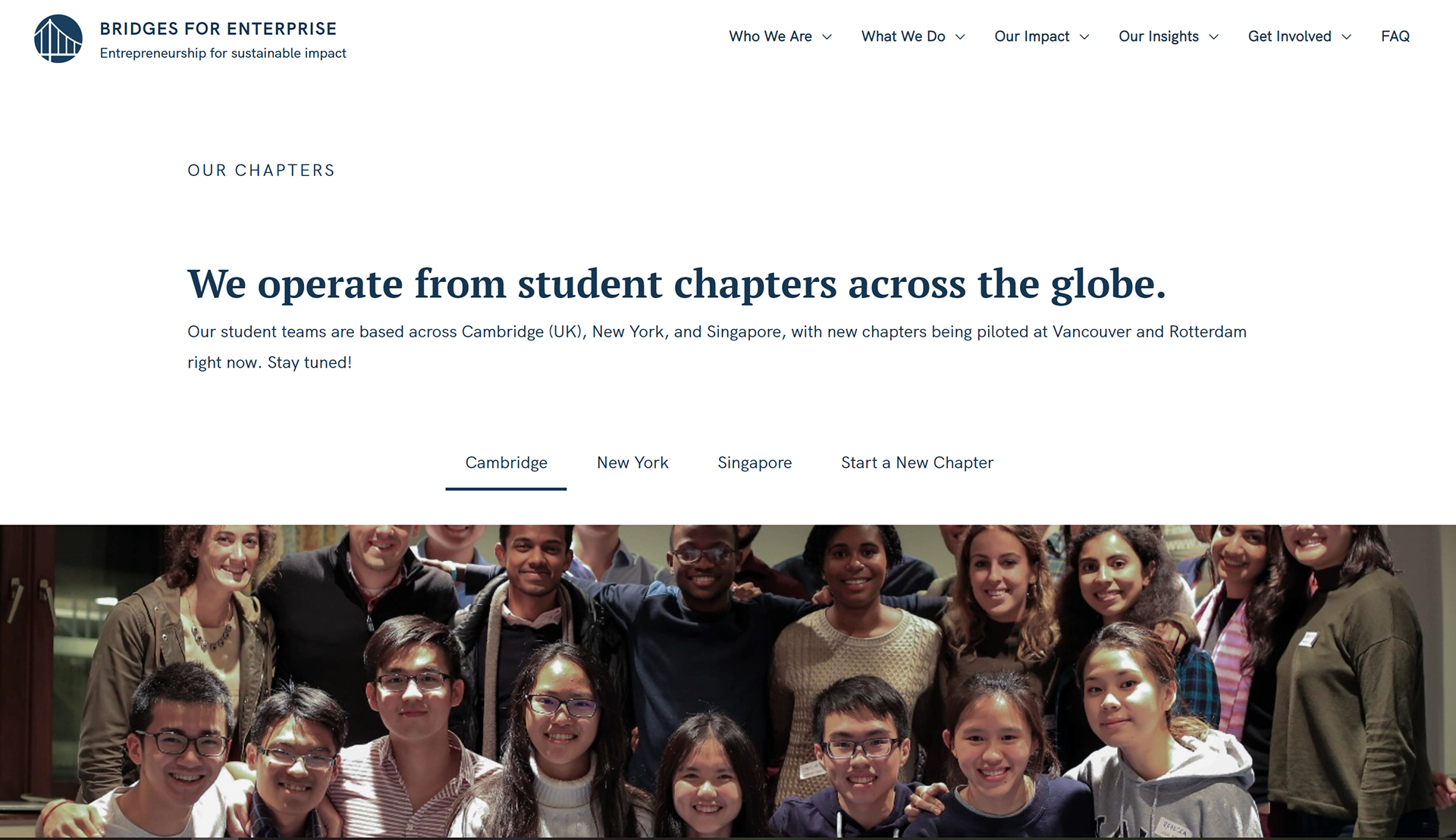
In order to build a brand-new website, we needed to do some research to figure out what wasn't working on the current website. We ran focus groups with the global heads of the organization, and found that the main complaints were about the dullness of the current site, as well as content that needed to be added. BfE leaders wanted the global nature of the organization to be emphasized on the home page, and for its mission to be more succinctly stated.
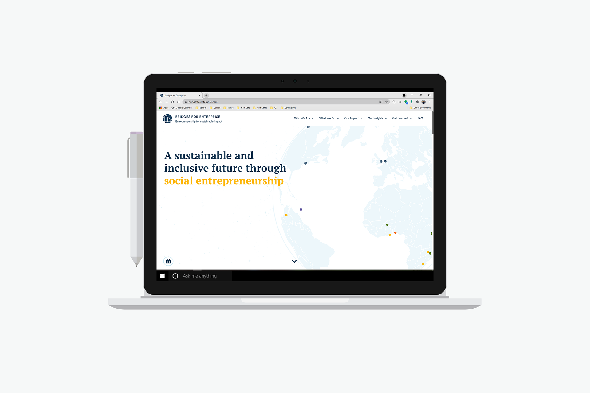
BEFORE
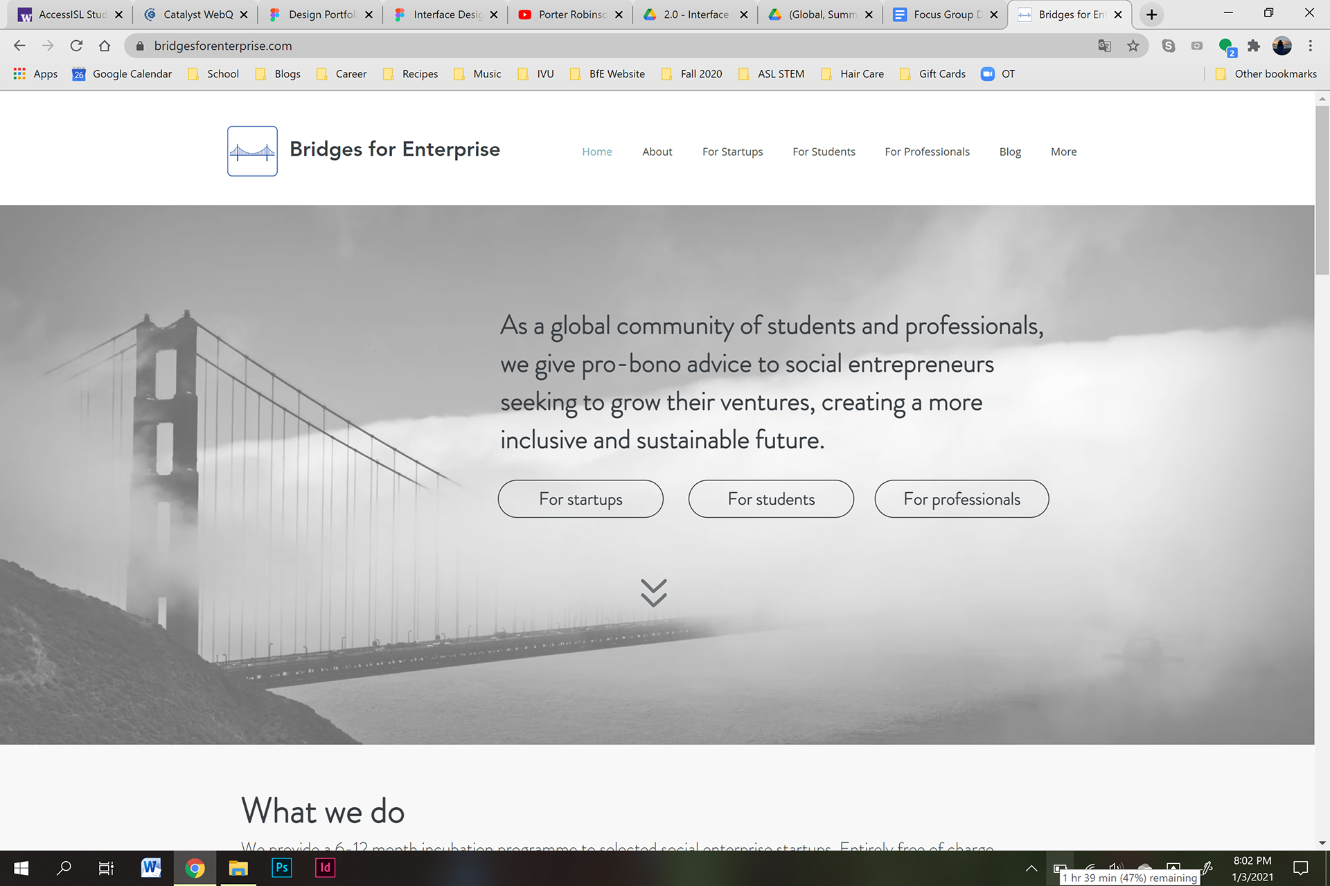
AFTER
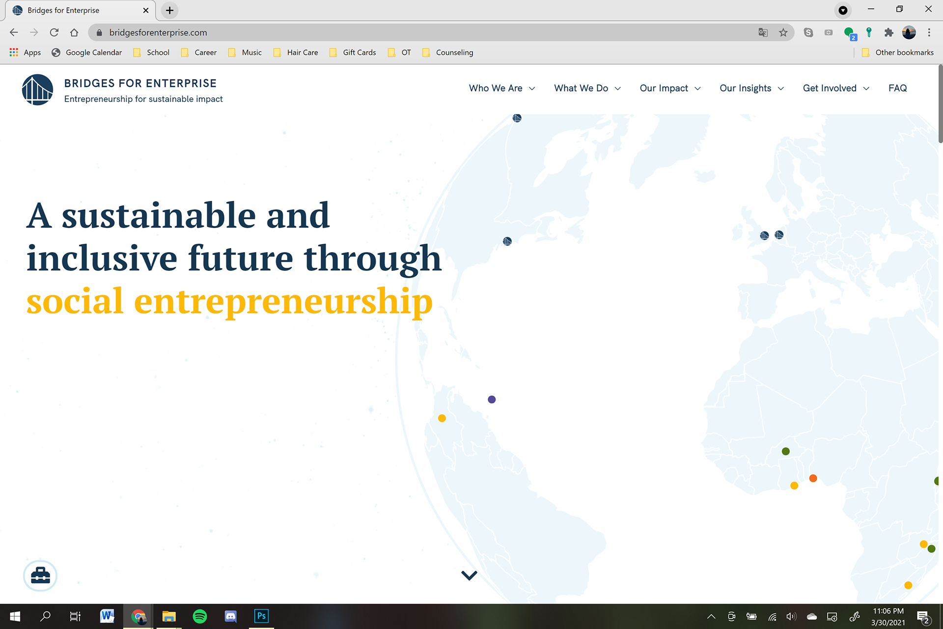
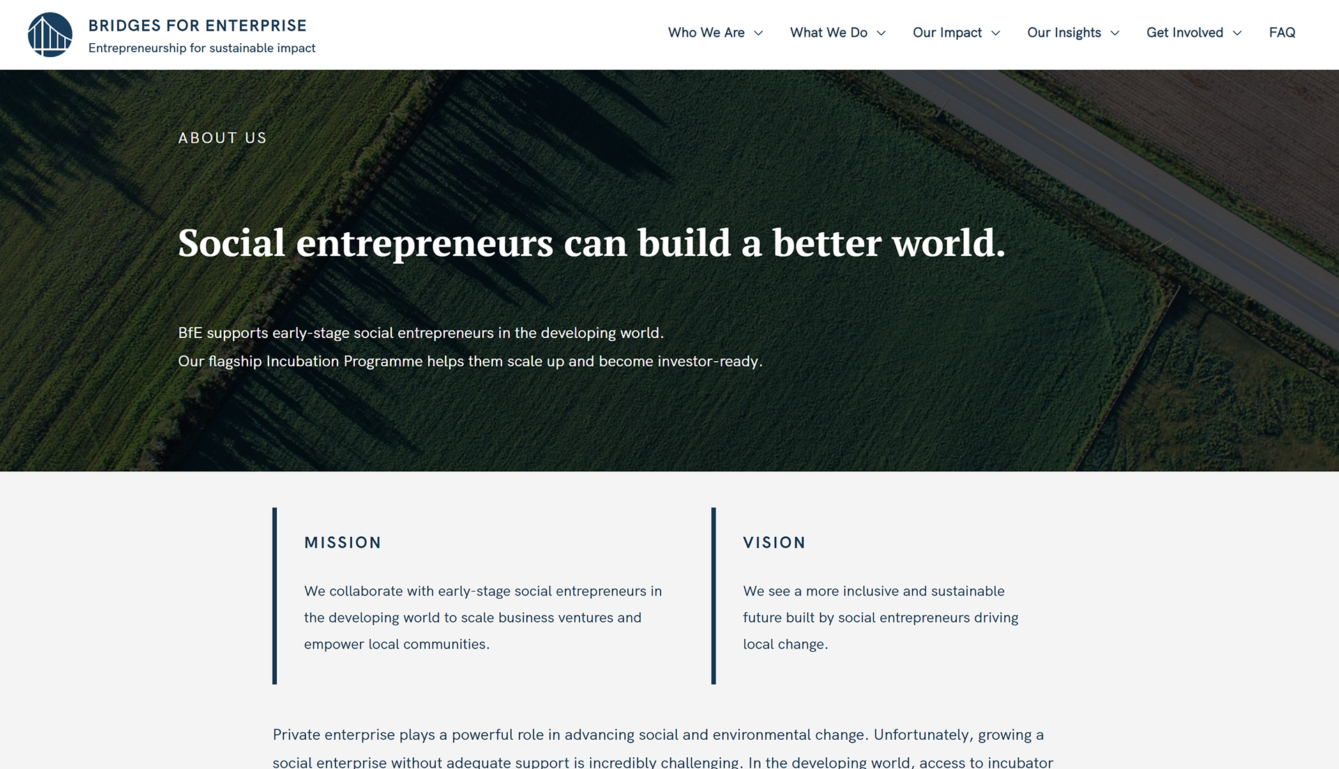
I chose to keep the color palette mainly blue, as there was already a strong connection between BfE and blue. However, I added a yellow accent color to give the site a bit more life. Additionally, we decided to bring in a serif font to add more contrast and give an appearance of seriousness to the site.
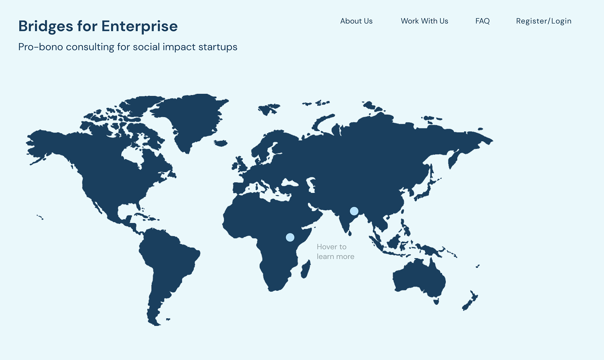
We decided to make an interactive map to show where all the startups involved in the incubation program are located. The map also serves to show information about each startup's mission.
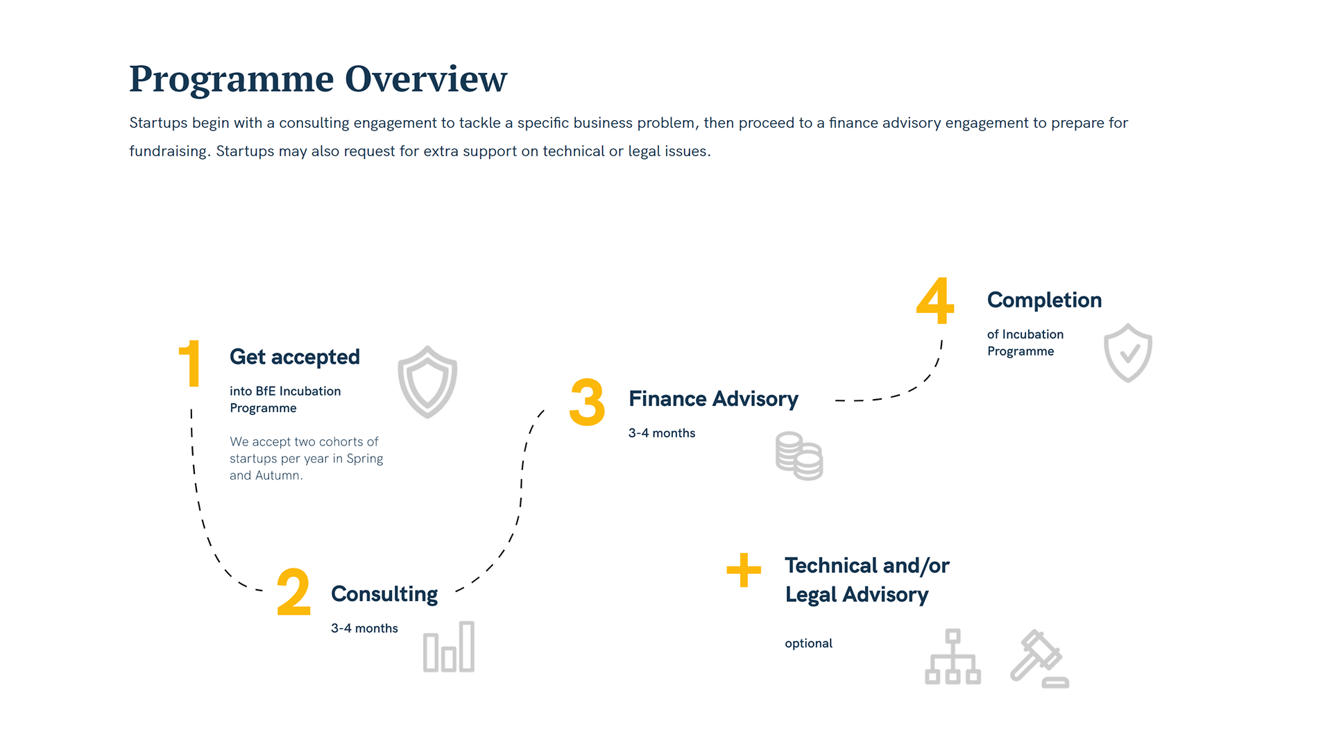
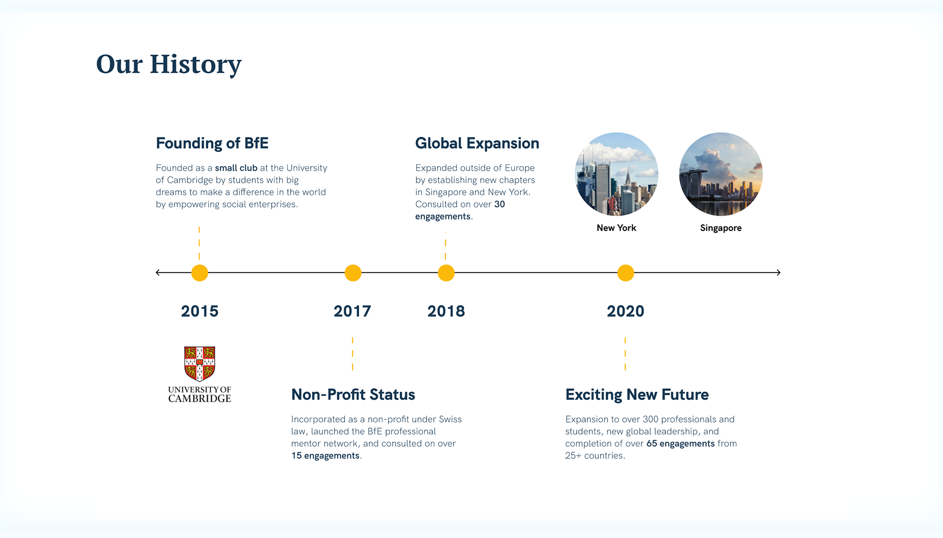
I designed a diagram that showed each step of the incubation program process to help startups see what kinds of assistance BfE could give them, as well as a timeline that showed BfE's history. It was a challenge to keep the details consistent across the site, especially given the large volume of information presented on each page.
PROCESS
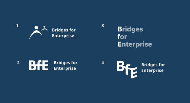
At the beginning of the process, I created mockups of the website and came up with many logo ideas. Our final logo ended up still containing the bridge logo, but with a more sleek icon and typeface.
FINAL WEBSITE
I was in charge of implementing all the design changes across the WordPress site, which was quite a massive task. It was my first time using WordPress, and my first time completely redesigning a website, so it was quite the learning curve. Although we had only planned for it to be a summer internship, I ended up working on it all the way into winter.
LEARNINGS
I learned that prototyping a website is much, much faster than actually implementing it, especially when there are many stakeholders involved. I learned not to overestimate how quickly changes can be made when it comes to technology, and to anticipate roadblocks in putting up a website. Not everything that I made ended up on the website - I had to let go of some of my 'design babies'. I also learned that it's incredibly satisfying to see a website through from its inception to its implementation, especially when it's for a justice-oriented cause. I had the chance to work with some incredibly kind and hardworking people, and I am very grateful for this experience.